Thursday, November 11, 2010

Cutouts

 Squirrel; 9.23.2010; 3:17 p.m.; Rexburg, ID; f/4.0; 1/640; Canon PowerShot SX120 IS
For this cutout I first edited the photo in Camera Raw and slightly adjusted vibrance and blacks. I then brought the image into Photoshop and adjusted levels slightly. I used the QuickSelect tool to select that part of the image I wanted to remove. I created a new layer (Shift Command N) and filled it with white by hitting option delete. I deselected and then hid that layer. I then switched to the image layer and used the QuickSelect tool again to select the squirrel. I made sure to zoom in a great deal to clean up the selection. Next I went to Select-Refine Edge. I added some feathering to soften the edges and the selection a bit. Once it was refined, I copied the selection to a new layer (Command J) and revealed the hidden layer to get the final result.

 Mickey Balloon; 9.18.2010; 2:28 p.m.; Richland, WA; f/3.5; 1/400; Canon PowerShot SX120 IS

For this cutout I used the QuickSelect tool in Photoshop to select the balloon. I then went to Select Inverse, to select everything except what I had  manually selected. I pressed delete to leave just the image of the balloon and then refilled the background with this solid blue color. I refined the edges of the balloon by going to Select, Refine Edge and adjusting the feathering of the image. I also added a slight shadow to help the edges blend better.

Night & Light

Moving Light Capture; 11.9.2010; 8:28 p.m.; Rexburg, ID; f/22.0; shutter 10.0; Canon Rebel T1i

Moving Light Capture
For this image, I knelt on my bed and shot out my window. With TacoTime and a big yellow crosswalk sign, I thought this would be a good place to have a night shot. Cars traveling on the road also added light streams on the road. I rested my camera on my window sill to prevent shaking and to get a clear image. A 10 second exposure was a good amount of time to caure these traveling lights and soak in the light from the building and sign as well.  


Light Painting; 11.9.2010; 8:29 p.m.; Rexburg, ID; f/5.0; shutter 10.0 second exposure; Canon Rebel T1i
 
Light Painting
For this image I sat the camera on a book to use as a tripod. I set the camera to shutter priority and set the exposure time to 10 seconds. With the shutter open this long I was able to get the above effect using my cell phone as a light. The reddish tint you see in the corner is the light that leaked through the closed door coming from the hallway. I really liked the effect this technique gave.
 
 
I Love You; 11.9.2010; 11:08 p.m.; Rexburg, ID; f/29.0; 8 second exposure; Canon Rebel T1i

For this image I had someone help me while I held the camera. I wanted to try another one of these light painting shots, so I had the person stand a fair distance away from me. Using a small flashlight they painted with light. I especially love the little "star" looking sections where the light was held a little longer. I loved the way the image looked and the fun feel that it has.


Camera Motion Painting; 11.9.2010; 8:35 p.m.; Rexburg, ID; f/11.0; 6 second exposure; Canon Rebel T1i

Camera Motion Painting
For this particular technique I set my camera to Shutter priority and used a 6 second exposure. I sat on my bed and pointed my camera out the window to capture the street lights, car lights, and building lights. I also had the blinds down for this shot, and that is how I achieved the dotted look in some of the lines, along with the shorter lines. I moved my camera quickly while pointing the lens at the lights and created this camera motion painting, 
 
Green & Orange; 11.9.2010; 8:46 p.m.; Rexburg, ID; f/16.0; 10.0 second exposure; Canon Rebel T1i
 
I chose to include another camera motion picture, because I loved the colors in this one. The image was created from the two smallest lights I could find. I shut off all the lights in my apartment and walked out of my room. The green light was coming from the clothes dryer, so I wanted to try something with that. I then took my computer charger and placed it on top of the dryer, to ge the tiny orange light. I set my camera to shutter priority and gave it a 10 second exposure. I moved the camera quickly to create this colorful effect.

Monday, November 8, 2010

Poster

1. Title: The Window
2. Date, Time, Location: 9.29.2010, 1:34 p.m.; Bannack, MT
3. Camera, F-stop, Shutter Speed: Sony DSC-HX1, Exposure Normal, f/8.0, 1/40
4. Edits: Camera Raw-slightly increased exposure, added fill light, and blacks, boosted clarity a bit and increased saturation and vibrancy. In Photoshop I added two different adjustment layers of hue/saturation to bring out certain areas where I really liked the color. I masked out parts of the photo (mainly the window) to keep them closer to the original colors. I also adjusted levels a bit to get the contrast just right. Originally the photo looked way too "sharp" and it appeared pixely. After some adjusting and even hiding one of my layers I was able to fix the problem and was even happier with the way the photograph looked.
5. Process, why you chose this image(s), and explain your photographic and editing techniques. I chose this image because it is one that I will love hanging in my own apartment/house someday. I love the feel of the photograph and the different colors. I especially loved the outside look and the composition of the photo with the interesting angle. When taking the photograph, I absolutely loved this little blue room and the checkered floor that accented it. I wanted to capture that, and I was pleased with the way the edited photo turned out. To be honest the final outcome kind of just happened. I started with the basic edits like I always do and then tried different filters etc. I didn't like any of the filters that I tried, so then I began adding/playing with the saturation and colors a little bit to make them "pop" more. I have been asked several times if this is an HDR shot, and it is not. It was taken with just a single exposure, but I did love that the final outcome gave it an HDR kind of effect--only I did it all on my own:) The photo has also been mistaken for a painting, and I love that as well because that is kind of my "style" for what I will hang in my home.

Tuesday, November 2, 2010

Photolusion

Baking Bread; 10.24.2010; 1:15 p.m.; Rexburg, ID; f/3.1; 1/60; Canon Rebel T1i

Water Droplet; 10.19.2010; 5:44 p.m.; Rexburg, ID; f/5.0; 1/640; Canon Rebel T1i

 This is an example of a Photolusion. A Photolusion is a photo that creates an illusion of something it is not. The image in this blog post is an example of a photolusion blend, which is when two or more images are blended together in Photoshop to create an illusion. 
I took these two images on different days, and had completely different things in mind when I took them. However, when I heard about the Photolusion, these two images came to mind and I wanted to blend them together. I opened both images in Photoshop and made minimal adjustments to saturation to bring out some of the coloring. I then used the quick selection tool to select the girl out of the photo. I took that image and placed it as a new layer in the leaf image. Using the eraser tool and also the paintbrush I helped to smooth some of the edges to make the blend look more realistic and erase hard edges. Through all of these steps I feel I was able to make a successful Photolusion.
 

Daily Photo Journal

10.26.2010
 Pumpkin; 10.26.2010; 11:15 p.m.; Rexburg, ID; f/5.9; 1/2; Casio EX-Z75
Camera Raw: increased exposure and vibrance

This pumpkin was the sum of this night. My boyfriend and I carved "Howard" and this made for a traditional Halloween shot. The fake candle provided fairly poor lighting, but I believe the image still survived and managed a holiday feel. 

10.27.2010
 Freedom; 10.27.2010; 6:14 p.m.; Pocatello, ID; f/8.0; 1/250; Canon T1i
Camera Raw: Exposure, Brightness, Contrast, Clarity, Vibrance
Photoshop: Vignette

This flag shot was actually taken while I was sitting at a stoplight. The sky was too perfect to pass up the opportunity, and although the lighting was slightly dark, I knew that with editing I could bring out the appealing colors.

10.28.2010
 Cycle; 10.28.2010; 10:00 p.m.; Jerome, ID; f/3.5; 1/4; Canon T1i
Photoshop: Adjustment Layer-screen, Vignette

This cycle shot was taken at a hotel in the workout room. I

10.29.2010
 Bridge; 10.29.2010; 2:52 p.m.; Twin Falls, ID; f/16.0; 1/100; Canon T1i
Camera Raw: Exposure, Recovery, Contrast, Clarity, Vibrance
Photoshop: Vignette

This shot captured one of the highlight of this day. It was taken in Twin Falls, Idaho underneath a giant bridge. I love the repetition in the photo and the contrast the photo provides. With some slight edits I was able to bring out the clarity of the image to maximize the overall effect.

10.30.2010
 Teague; 10.30.2010; 11:51 a.m.; Pocatello, ID; f/13.0; 1/125; Canon Rebel T1i
Camera Raw: Clarity, Vibrance
Photoshop: Vignette, Sharpening

How can you look at that face and not be happy?! This is my nephew Teague and I captured this shot as my sister was walking with him. We were headed back to the car and I just happened to have my camera out when Teague pulled his cheezy face :)
 
10.31.2010
 Harvest Time; 10.31.10; 1:18 p.m.; Inkom, ID; f/4.0; 1/2; Canon Rebel T1i
Camera Raw: Exposure, Recovery, Fill light, Blacks, Contrast, Clarity, Vibrance
Photoshop: Vignette

This photo was taken on Halloween so I wanted to capture something festive. The focal point was the pumpkin and I felt that the wheat in the background makes for a nice shallow depth of field. The shot was taken with light coming from a window, which created more contrast in the shadows.

11.1.2010
Homework; 11.1.10; 10.24 p.m.; Rexburg, ID; f/5.6; 1/40; Canon Rebel T1i
Camera Raw: Fill Light, Clarity, Vibrance
Photoshop: Vignette

Monday is represented by homework. I was sprawled out on my floor in my apartment bedroom and needed to capture one last image for the week. My Mac, planner and jar of pens and pencils are a very accurate representation of a typical day for me. The angle of the photo and the shallow depth of field create interest in this image.


Original Template

 Using one of the templates provided, I created my two page photobook spread. I used a clipping mask to move my photos onto the template and was happy with the way it worked out. I did this by making sure I used the large, original sized image. I then clicked on the photo layer, placing it directly above the layer I wanted to clip it into. I dragged the image over the photo box and sized my image the way I wanted by dragging the corner and holding shift. Then in the Layers palette I right clicked and chose Create Clipping Mask. I moved the images around to position them just right. Throughout the rest of the template, I changed the color of one of the boxes, because I felt the colors fit nicely. I also added text on the right hand side to say "It's the little moments that make life big." I reduced the opacity on the text to make it less noticeable--I want it to be something that you just happen upon, rather than it jumping off the page at you.

Tuesday, October 26, 2010

Edge Effects

Double Fade Border

Michelle & Sam; 10.16.2010; 5:31 p.m.; Rexburg, ID; f/8.0; 1/125; Canon Rebel T1i

For this edit I opened the image in Camera Raw and adjusted the exposure. I added blacks and contrast to make the colors pop more. I then took it into Photoshop and cropped it to be 9x7 inches. I went to Image-Canvas size and added one inch to both the height and width to end up with an 8x10 size. I then drew a rectangle on the image using the shape layer rectangular tool and added a layer mask to the shape layer. I chose the Fill Pixels option of the rectangle tool and drew a black rectangle to mask the other rectangle and bring back the image. I reduced opacity of that layer to 61% and then added a motion filter to it. 


Brushed-On Effect


Cobweb Doorknob; 9.29.2010; 10:34 a.m.; Dubois, ID; f/2.8; 1/2000; Sony DSC-HX1

For this edit I opened the image in Camera Raw and increased contrast and clarity to give it a nice, crisp feel. I loved the effect it gave and how it made the cobweb and old texture of the door stand out. I also decreased exposure and saturation. Then I took the image into Photoshop and did a Command A to select all. I loaded the History Brush tool and used the Thick and Heavy Brushes to paint the image back and give it the nice feel that it has. It took me a few tries to get the hang of the brushes, but I loved them after I got used to it. After creating the edges that I wanted, I added some canvas space to increase the border on the outer edges and give it a frame.


Sprayed Edge Effect


Old Chevrolet Building; 9.29.2010; 10:36 a.m.; Dubois, ID; f/2.8; 1/1000; Sony DSC-HX1

For this image I brought it into Photoshop and used the rectangle Marquee tool to drag a rectangle about an inch from the edges of the picture. I then applied the Quick Mask Mode and added a Sprayed Stroke filter to give the edges the effect that they have. I increased the length and radius to the maximum sizes to make the effect more dramatic. Finally, I added a border by increasing the canvas size and added text to the image.

Monday, October 25, 2010

Scanography

One Scan:
For this project I gathered Halloween items and arranged them on a Lexmark scanner. It took me several tries to get the items in an order that I liked them. I was amazed at how challenging it was to place things where I wanted them, but overall I was pleased with the final product. This scan has no edits.
Spooky; 10.25.2010; 2:32 p.m.; Rexburg, ID; Lexmark Scanner


I had a fun time with the one scans, so I am including a second one that I did. I gathered items from my apartment that represent things that make me happy (family, playing games, jewelry, and coloring!) This scan also took me several tries to arrange the items where I wanted them, but I was happy with the way it turned out.
Happiness; 10.25.2010; 2:05 p.m.; Rexburg, ID; Lexmark Scanner

Collage Scan: 
Pineapple; 10.25.2010; 2:34 p.m.; Rexburg, ID; Lexmark Scanner

Artichoke; 10.25.2010; 2:45 p.m.; Rexburg, ID; Lexmark Scanner

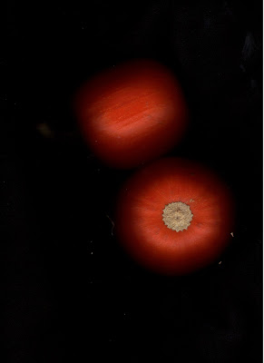
 Pumpkins; 10.25.2010; 2:36 p.m.; Rexburg, ID; Lexmark Scanner

For this collage scan I did individual scans of the two tiny pumpkins, a pineapple, and an artichoke. I then opened each of the individual photos in Camera Raw and adjusted exposure and added contrast to brighten the images. I took them from Camera Raw into Photoshop and drug the layers on top of one another to create one image. I placed the different produce images in the areas I felt they best fit and used the erase tool to show the images in the layers beneath. I then merged the layers and added an adjustment layer to increase the saturation a bit more of the overall image. I used a combination of the spot healing tool and the paintbrush tool to soften some of the harsh "glares" created from the scanner light and also to match the black background color throughout the entire image. I thought the final product turned out nicely. And who know you could do these sort of things with a scanner?!